Sandbox Identity
2022
For our new R&D-focused Instagram channel, BUCK Sandbox, we needed an identity that evoked the raw, experimental spirit of the initiative. We also wanted something that conveyed the infinite possibilities of tech and design working (and playing) in harmony.
Pixel Workflow
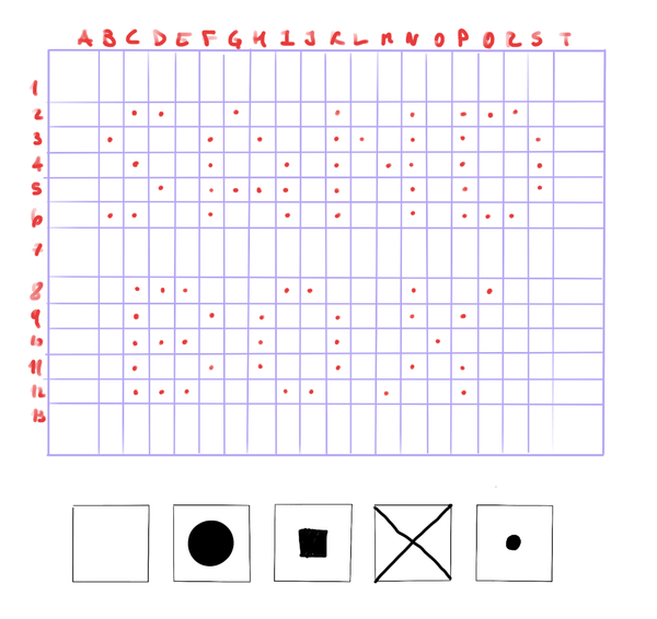
We knew from the start that we wanted the logo to fit inside of a modular grid.
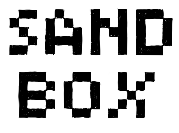
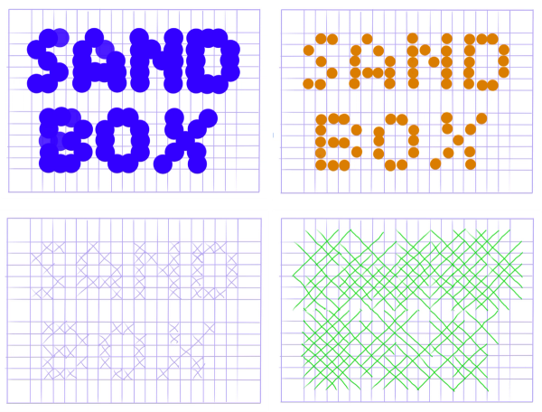
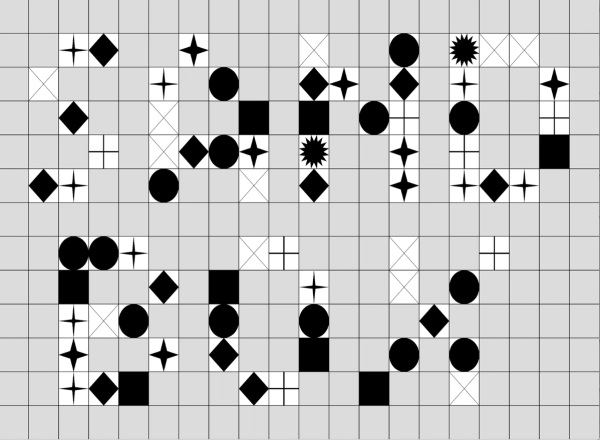
The goal of our sketching phase was to create a logo with the least amount of pixels so we could clearly map it out inside of a grid. We were curious to see what it would look like if we swapped square pixels with different shapes.
Feed the Logo to the Programs
We continued the exploration phase by plugging the logo into different environments, like Cinema4D and p5.js. Now that we were working within a digital grid, the key was to find a way to create an interactive and ever-changing solution to the static results we were getting.
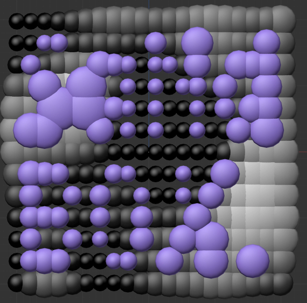
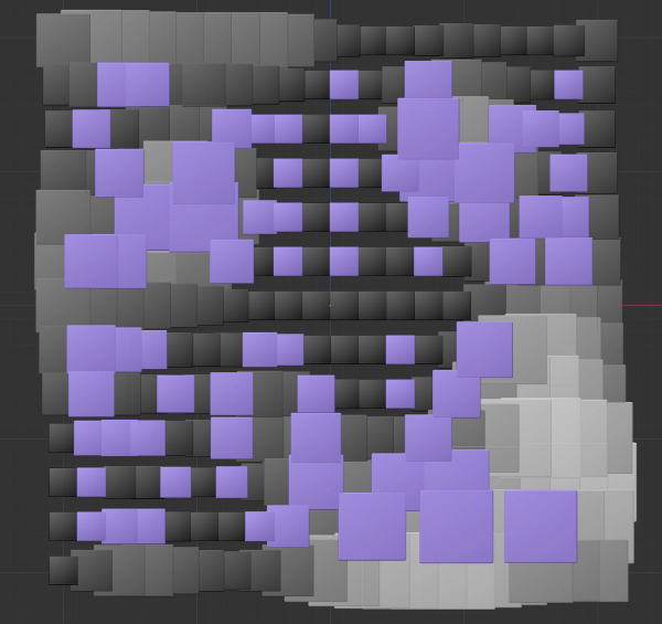
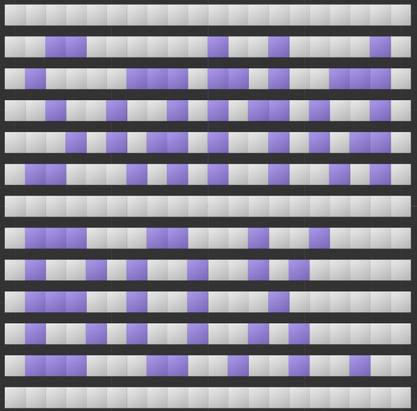
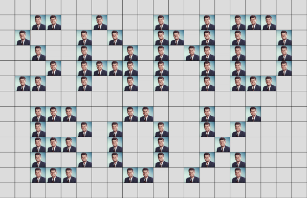
Pushing Pixels with Code
Our creative technologists leveraged p5.js to replace the square pixels with different sprites and create a modular grid to form the logo. We were then able to manipulate the grid with our cursor and produce a different logo just by wiggling our wrists.
But we needed to find a middle ground to ensure readability and a cohesive design.
Final Outcome
Our final logo is comprised of squares and stars that can be distorted. The latter is mapped to the current day and time to give it a life of its own, setting up a routine of identity transformation for whenever we release a Sandbox post.
As an additional interactive nugget, the CT team experimented with PoseNet to distort the logo based on the position of the user's nose. Some wacky face-dancing ensued, and the full circle of collaborative fun was complete.
BUCK
Art Director
Guillermo Zapiola
Design
Ayla Mortada
Creative Technologist
Jules Kris
Rozi Zhu
