Residence Rebrand
2025
In a world where everyone has access to the same creative tools, what separates good work from great? For Residence, a growing network of creative companies, the answer lies in something that can't be automated: taste. We helped them build a brand system that celebrates its collective intelligence while giving each member company the freedom to shine.
Strategy
Our challenge: create a brand identity that unifies a diverse network of companies without flattening their individuality. Like a museum or gallery, the system needed to accommodate a broad spectrum of voices while maintaining a distinct point of view.
We also needed to articulate what sets Residence apart from traditional holding companies and express its "tastemaker edge" in a world oversaturated with disposable content and algorithmic sameness.

Logo
A bold iconic R anchoring the foundation, with letterforms blending sharp and round edges. Designed from "many parts," the wordmark harmonizes contradiction — stability yet assemblage, harmony with tension. Like the network itself, the mark gains strength from the purposeful arrangement of distinct elements.


Typography
We chose a primary typeface for its expressive yet functional character — capable of telling any story while remaining accessible across every application. High contrast confident contours establish visual DNA that's modern yet rooted in classic principles.
Color Palette
Playful, professional, and broad, the color system flexes from quiet and utilitarian to bold and adventurous, adapting to each company's creative instincts.

Pictograms
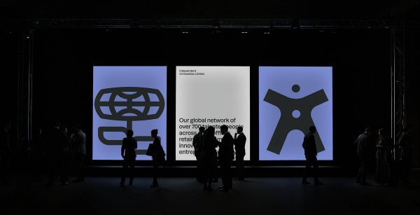
To express Residence’s shared beliefs and values, we developed a living library of custom pictograms. Rooted in the modernist tradition of symbol design, but built for organic growth, these forms represent core values that can layer, combine, and interact like organisms in creative tissue.
The hand-drawn gestures ensure the system never feels too systematic — creativity thrives in ecosystems that feel personal, imperfect, and alive.
Motion Guidelines
A library of motion guidelines and social media templates that bring the brand to life across platforms, enabling infinite creative expression while preserving essential genetic code.
The Result
Together, these elements form a brand system that is both flexible and focused. It amplifies the voice of the network without overpowering its parts.
Six months later, the identity had evolved into expressions we never designed but always intended — proof that we'd built something truly alive.
It’s a reflection of Residence itself: a place where diversity fuels excellence.


BUCK
Executive Creative Director
Orion Tait
Creative Director
Max Vogel
Yker Moreno
Art Director
Max Friedman
Strategist
Asia Hunt
Executive Producer
Kim Stephens
Producer
HJ Kim
Laura Goehrke
Associate Producer
Wolfgang Schiavo
Copywriter
Rob Hirst-Hermans
Designer
Haeri Cho
Justin Fines
Kate Wu
Matthew Tapia
Rafael Bessa
2D Animator (AE)
Nick Knezevich
Tinghe Yang
Yinan Liang
2D Animation Lead
Sean Merk
Group Creative Director
Daniel Oeffinger
Chief Design Officer
Ben Langsfeld
Music & Sound Design
Fran Mejía
