The New Yorker Festival 2021
2021
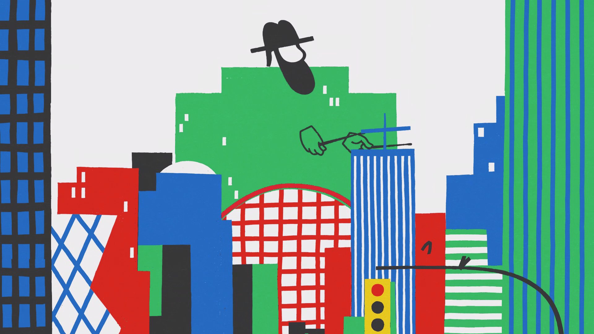
The New Yorker, our favorite cornerstone of highbrow culture, came back to us for a second year in a row to create the illustrated branding system for their annual festival. This included an anthem film to kickoff the event as well as a graphics package used during the livestream. This time around, as Covid restrictions were loosening and we were timidly emerging from our cocoons, they wanted to strike a celebratory tone that spoke to the (centennial anniversary) spirit of the Roaring 20s. Break out the bathtub gin!
What If People Were Buildings?
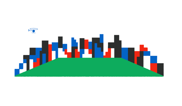
Our first step was to define the visual concept that would be the foundation for our system. Eventually, we zeroed in on a simple concept that leapt up from our sketchbooks: What if buildings were people? What if we saw two buildings going on a date? What if we saw a building walking its dog? What would that look like?


The New Yorker gave us the green light to run wild with our “buildings are people” concept, and we did just that. We started with a poster design. but the final illustration and design system needed to work for print, web, motion, and in-person experiential design.


A Toolkit for Every Occasion
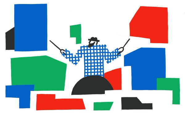
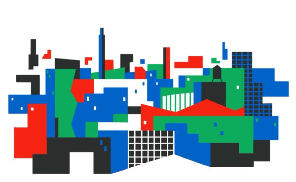
Our toolkit needed to work modularly to allow for different sized layouts that could be altered on the fly depending on the festival’s needs. Besides illustrations, we created backgrounds, title cards, splash pages and other assets.



A Return to In-Person
The toolkit was also used for the branding for the outdoor in-person event, including signage, branding, etc.
Process
The concept phase was wild and free. We went in a lot of different directions from the hyper-literal to abstract. We investigated everything from old 1920s era New Yorker covers to Stuart Davis type jazz, trying to find something that felt both nostalgic and contemporary. Most importantly, it had to feel New Yorker-y, an esoteric and hard-to-pin-down blend of whimsy and sophistication.


“Buildingness”
This project is the result of fun conversations, collaborative brainstorming, and tons and tons of drawings. We racked our collective brains, placing NYC archetypes side by side with NYC architecture, attempting to create connections.
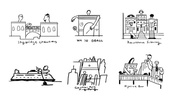

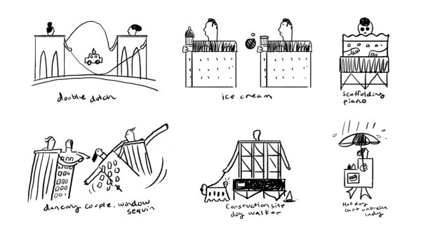


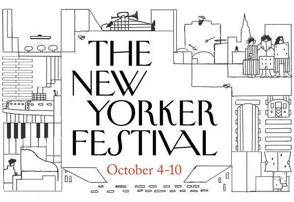
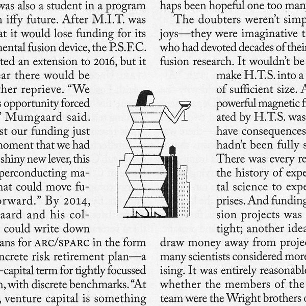
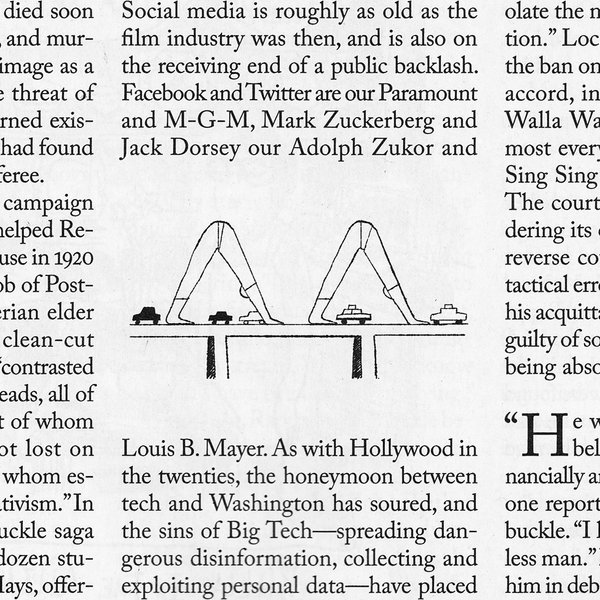
As a cherry on top, The New Yorker team asked to use some of our process sketches as a series of spot illustrations in the magazine, crossing a HUGE one off the ol’ bucket list.






BUCK
Group Creative Director
Thomas Schmid
Executive Producer
Ryan McGrath
Associate Creative Director
Ege Soyuer
Producer
Irka Seng
Tracey McDonough
Design
Cari Vander Yacht
Ege Soyuer
Laurie Rollit
Remi Sorbet
Thea Glad
Initial Exploration
David Evans
Guillermo Zapiola
Hyung Soon Joo
Janice Ahn
Joyce Ho
Kenesha Sneed
Paola Chen Li
Xia Gordon
Animation Lead
Kyle Snider
Storyboard
Cari Vander Yacht
Ege Soyuer
Laurie Rollit
Animation
Junyi Xiao
Kyle Snider
Ryoko Kondo
Stephen Loveluck
Thea Glad
Creative Technologist
Charlie Whitney
Daniel Vettorazi
Evan Boehm
Michelle Higa Fox
