House of Honey
2022
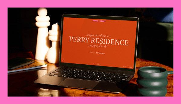
California-based House of Honey wanted to create a celebratory, inviting, and bold brand system for their interior design firm that incorporated their love of art, fashion, and vintage interiors. Ready for a full departure from their previously minimalistic approach to branding, we set out to create a maximalist system that honored the various styles of their clients and projects and celebrated the art of gathering.

Expressive and bold
Excited to create something fresh, we partnered with the client to refine the aesthetic approach in a collaborative way. Informed by their love of fashion and art we went for a maximalist look — bold, expressive and unapologetic. The rich palette, with its playful pops of neon, worked well with our sophisticated gestural scripts that helped to elevate the overall look.

Gather round
One of House of Honey’s main goals is to design moments with playful possibilities, spaces with soul that attract gathering — and that was the exact system we set out to create. One that felt playful with a multitude of possibilities for color pairings, logo use, and system tools. The end result was a rich, soulful, and ownable look.


Finding the Sweet Spot
Right off the bat, we knew we were on the same page as the House of Honey team. Their impeccable taste and experience in a creative industry established an immediate sense of trust, and we found a really enjoyable balance of making the creative process a fun exploration that consistently produced the goods and emphasized productivity.
For the website, we got to work with Replica—a hybrid studio focused on design, communications, and research with (almost) as many global HQs as BUCK. Their clean, elevated aesthetic sat perfectly with the vision we shared with House of Honey—and the elements came together beautifully on the live site.

The sweet, sweet extras
The additional bits and pieces that come during or after a project can serve as great reminders of the fun we had immersing ourselves in the process. For House of Honey, the work was focused on their brand and image, which meant we got to design some fun “extras” as part of the overall branding exercise like candles, room spray, posters, matchbooks, and even custom monogrammed napkins.

The end result
The end result was a holistic system with a look and feel that hits on all of the brand goals of creating a sense of invitation, warmth, and being unapologetically themselves in the space they are creating for. We loved working with House of Honey and showing off more of our range in the branding space.


BUCK
Group Creative Director
Camille Chu
Associate Creative Director
Emily Simms
Art Director
Abbie Winters
Designer
Wesley Chen
Executive Producer
Justin Harris
Senior Producer
Mackenzie Kuzman
Brand Consultancy
The Creative Culture
Web Design
Replica
