J.P. Morgan Payments Creative Expression
2025
How do you convey expertise? How do you communicate security? How do you signal innovation? How do you make someone feel trust? Our collaboration with J.P. Morgan Payments found us seeking answers to these fundamental questions. The challenge was not just communicating these sentiments through language but discovering a way to evoke these feelings in every aspect of our strategy and expression in a way that’s distinct and enduring. Let us take you on the journey of how we created a memorable and unique expression for a business within one of the most legendary banking institutions in the world.
Strategy & Positioning
J.P. Morgan Payments is always guided by its clients' needs so that was the place to begin. Our journey started with a robust strategic survey that unearthed some fascinating insights. Our research showed that Payments clients value two attributes in a partner, above all others: Trust and Innovation. As we began to unpack these, we discovered a perceived tension between them that we were determined to resolve.
J.P. Morgan has a natural advantage when it comes to Trust due to the depth of their generational commitments and their storied legacy and heritage. Trust is a complex and layered term — inherent within is expertise, security, stability, and reliability as there would be no trust without it. This entrenched equity sets J.P. Morgan apart in an industry where credibility is paramount.
Words like “legacy” and “heritage” are often interpreted as being on the opposite end of the spectrum from innovation but this is a misguided perception. Since its inception, innovation has been the cornerstone of J.P. Morgan’s resilient legacy and a central theme in the J.P. Morgan story.
We wanted to develop a distinct narrative around innovation so we examined what that means to J.P. Morgan Payments. Always client focused, J.P. Morgan Payments knows that their customers are seeking secure, intuitive solutions that optimize their payments. This means simplifying complexity, which is what you can expect from a classic brand like J.P. Morgan. J.P. Morgan Payments keeps their clients at the center of every advancement they make — a stark contrast to the “move fast and break things” crowd.
Building on that foundation of trust established over generations, J.P. Morgan Payments represents the combination of premium service with a human-centric approach to innovation. Their enduring expertise and client centricity enables them to serve their clients’ needs today and tomorrow.
Color & Typography
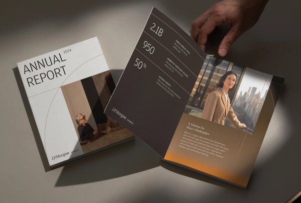
The Payments color palette retains the iconic J.P. Morgan brown and expands it into different shades. These familiar, earthy tones blend with clementine, topaz and blue into new gradients that add richness, sophistication, and depth and signal both our heritage and tech-forwardness.
The typography system is built around the two distinct font families in the existing J.P. Morgan design system: Amplitude, which has a geometric modernity that leans into technology, and the sophisticated serifs of Celeste. Together, they create a harmonious balance of clarity and elegance.


Linework
To represent constancy and the fluidity of payments, we introduced linework that would push the innovation and tech-forwardness of Payments further. This graphic device consists of straight lines, circles, and squares that serve as simple metaphors for the connections Payments makes with its global customers.
When these lines intersect with others, we feel their intentionality. The linework emphasizes precise connections that create unique compositions or help to convey data. The linework can also help to make larger amounts of information feel organized while remaining compelling and refined.


Graphic Imagery
Our system of graphic imagery is grounded in premium textures and nuances, drawing connections to Payments tech-forwardness, trust, and heritage. They enable Payments to convey a more expansive, forward-looking narrative that effectively communicates ideas that may be challenging to express through traditional visual formats. We further support those narratives by putting them in motion.
The chosen materials are often associated with physical technology, particularly metals and glass that can take on a glow effect. These are contrasted with woods and golds that make the graphic imagery bespoke to Payments, but also convey the premiumness of their offered solutions.Their behaviors are carefully crafted, often layering, activating, emerging or revealing, depicting core payment themes of movement, innovation, and exchange.


Photography
J.P. Morgan Payments is always client first so we strived to forefront that humanity and warmth in our photography. We wanted images that felt at once modern and timeless — scenes designed to communicate metaphorical and emotive themes with a visual connective tissue. The photos we created showcase professionals at work, telling the story of trust, expertise, partnership, and global scale through authentic expressions and interactions.
Spaces and materials were carefully chosen, delving into an appreciation for the rich hues of cherry, mahogany and walnut, while balancing depth through motivated light sources that illuminate the subjects — offering both dynamism and optimism.
In the end, we created a new, modular library of photography that can be used for a variety of placements and situations.


Motion
A new motion system for Payments is confident and connected, with a focus on typography and linework — all working together to elevate the system and reinforce our themes.
Movements flow from one to the other, connected through a patient and fluid rhythm and cadence, deliberately revealing information to viewers in a subtle and focused manner.
BUCK
Group Creative Director
Camille Chu
Creative Director
Dan Gregoras
Executive Producer
Russell Greene
Producer
Alex Decaneas
Avery Wright
Elizabeth Abrams
HJ Kim
Jess Pierik
Art Director
Arielle Casale
Mary Kate Henry
Associate Producer
Dani Ortega
Khadim Dieng
Head of Strategy
Marla Moore
Strategy Director
Cole Hammack
Tina Surelia
Strategist
Madison Caprara
Copy Director
Dave Evans
Copywriter
Brooke Kessler
Charlie Short
Storyboard Artist
Max Forward
3D Design
Simon Rönnerdag
Designer
Codie Chang
Danni Xi
Emilia Tonello
Heewon Kim
Julie Alter
Kate Wu
Kenni Huang
Lorena Manhães
Noel Núñez-Caba
Richard Dixon
Nikko Gary
Mark Kulakoff
Colin Graham
Head of 2D
Mercy Lomelin
2D Lead
Sean Merk
2D Animator (AE)
Hannah Sun
Ryoko Kondo
Adrian Moran
2D Animator (Cel)
Tinghe Yang
Ben Ommundson
3D Supervisor
Bill Dorais
3D Lead
Ryan Musselman
3D Animator
Gabriel Barbosa
Michael Russo
Editor
Billy Kostka
Assistant Editor
Jonathan Weisburst
Special Thanks
Mackenzie Kuzman
Kevin Brainard
Lauren King
Colin Graham
Camille Safadi
Luca Rojas
Audrey Kang
Emma Howcroft
Daniela Chun
Vicky Chong
Jose Flores
Victoria Kociman

