McNificents
2021
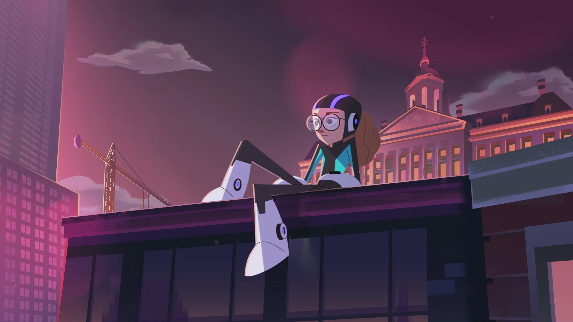
Joining forces with our friends at TBWA/Neboko and bringing great design and emotional storytelling to the fun superhero action of the McNificents campaign, we put a BUCK spin on classic tropes for a great cause: The Ronald McDonald Children’s Fund.
The Cause
The Ronald McDonald Children’s Fund enables families and loved ones to be close to their sick children in the hospital. Research has shown that having loved ones close by has a positive, healing effect on the mental and physical well-being of children in the hospital.

Introducing Liz
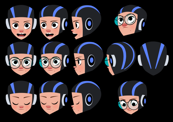
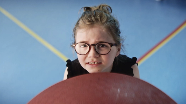
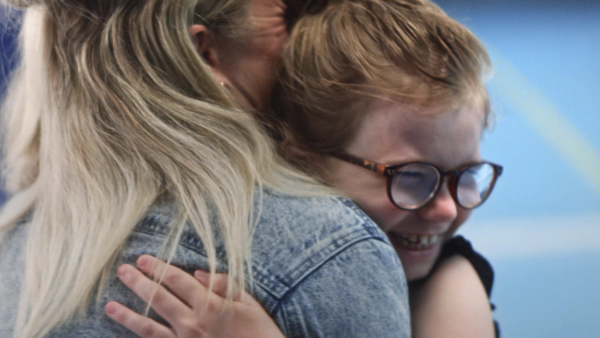
We added a new character to the McNificents superhero roster based on a real-life hero of ours: Liz, a 10yr old who suffers from a head injury due to a collision with a scooter.
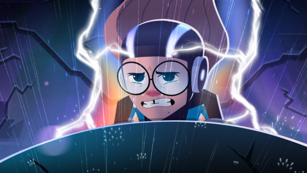
After two surgeries to reconstruct her skull, she’s working her way through physical therapy. We wanted to respectfully tell Liz’s story without making it sad. Because Liz is a beautiful human with a big lust for life, we wanted to champion her disability as a superpower.
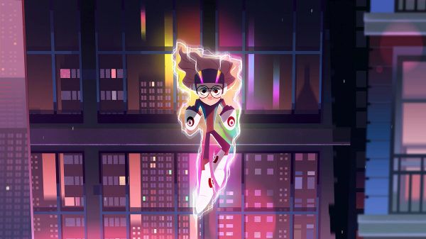
Power Up
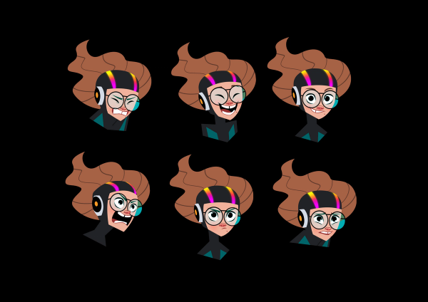
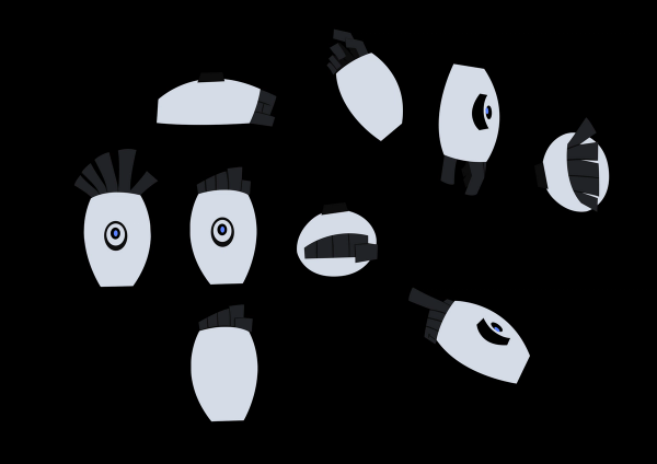
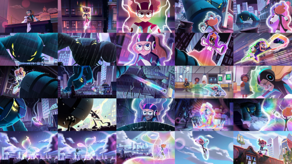
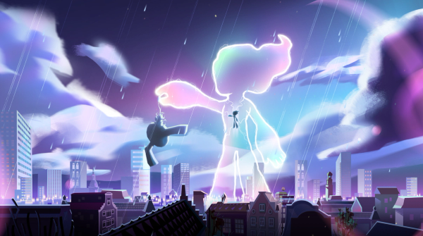
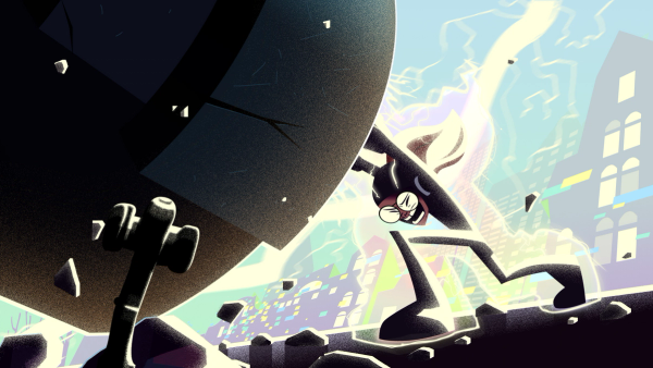
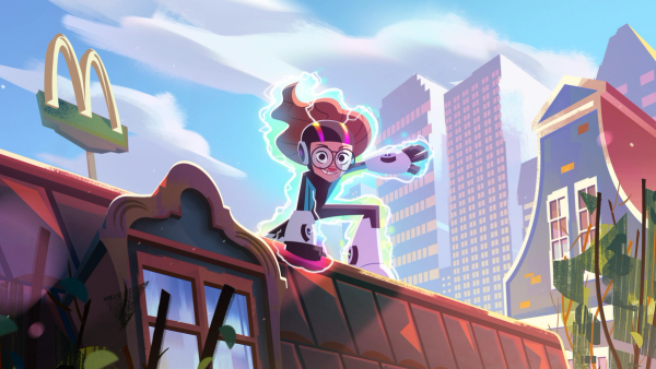
Because of the nature of her injury, we gave her a supercharged forcefield that emanates from her special helmet and keeps her safe. Liz told us her favorite color is “rainbow,” so we imbued her forcefield with all the colors we could muster.
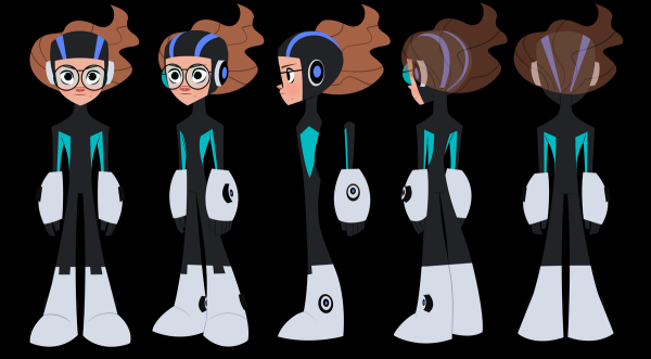
Action!
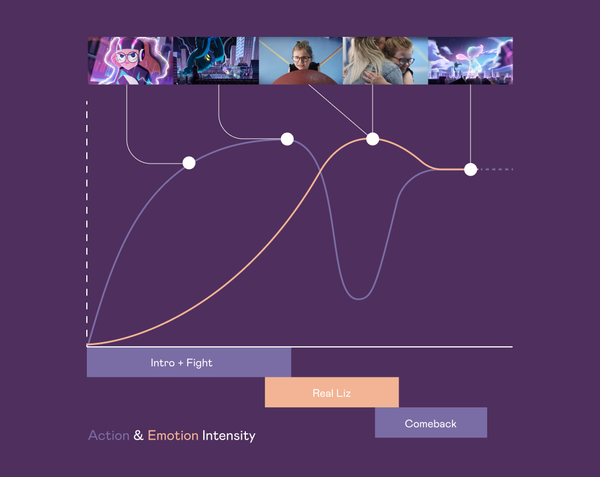
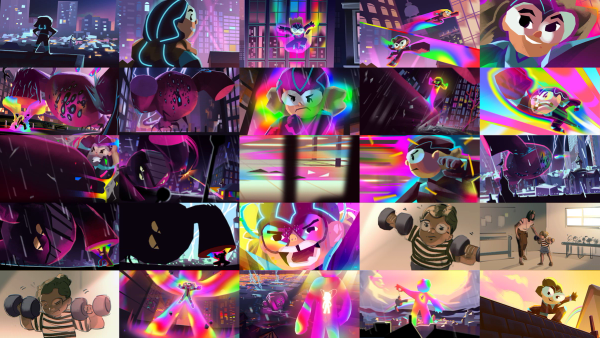
We don’t get to dabble in superhero action very often but we like to get out of our comfort zone, so this was a welcome challenge. We envisioned an epic story — the classic hero’s journey, struggling to overcome obstacles before the ultimate triumph. The look and feel of the spot was inspired by everything from childhood memories to contemporary action hero fare.
The Monster Design
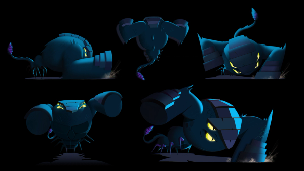
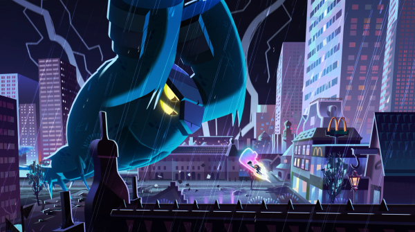
The monster is a reflection of Liz’s trauma. It’s got two big hammer like arms bent on destruction. Liz also told us she didn’t like spiders and insects so we incorporated elements of those into the monster design.
Mixed media
This was a fast 45-second edit and a mix of live-action with the real life Liz (15 sec) intercut with our action-packed cel animation (30) sec. We got to spend a day with Liz on set and a day in the sound studio to do voice recordings — these interactions really made this project something special.
The Pipeline
This project involved a superstar cel animation team on three continents. Because of the time zone differences between the BUCK offices, there were only a few hours a day when the team wasn’t working.
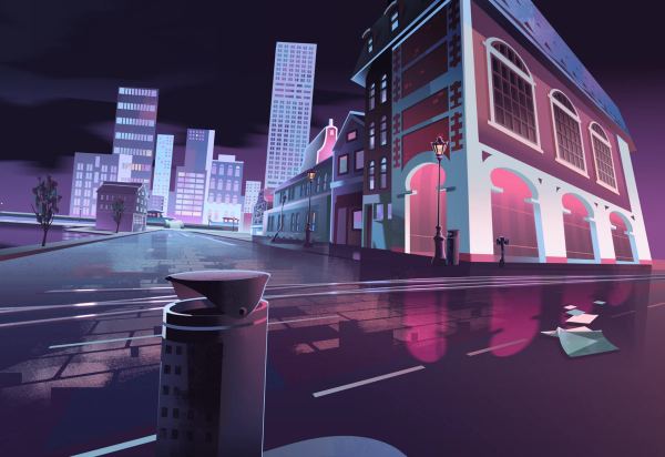
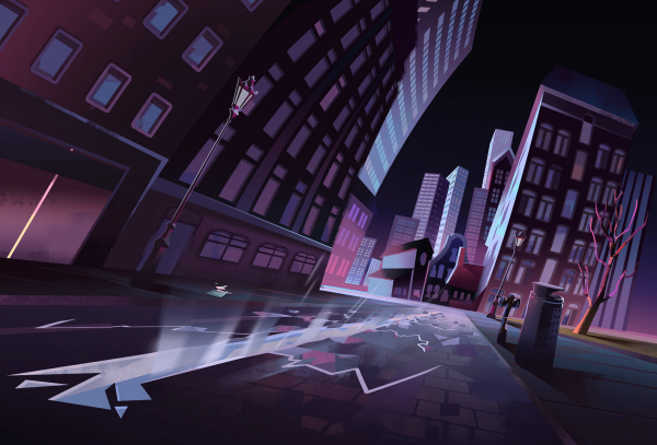
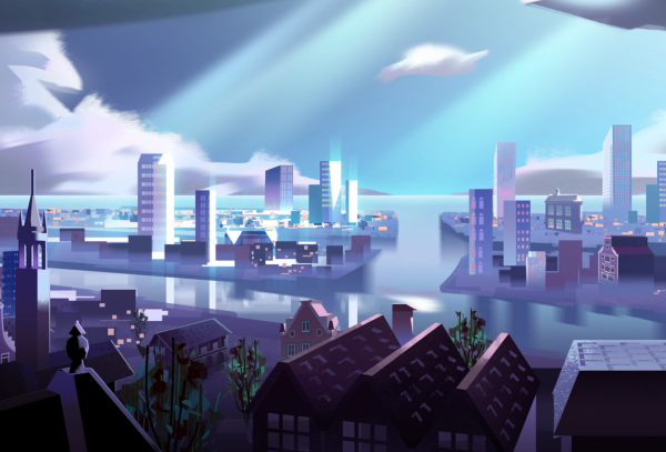
We anchored the spot around strong illustrative keyframes, so we were confident we were hitting our marks. In terms of style, we wanted to tilt a bit darker (and grimier) to hit the right emotional notes.
The combination of high-end cel animation, heavy compositing work, and dynamic cameras in a multi-technique environment makes this spot pretty unique for the advertising world. The montage style we employed was closer to classic anime than the mo-graph transitions we’re sometimes known for.
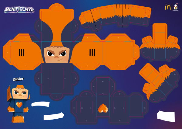
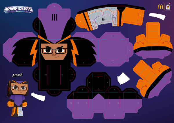
We also designed these cool paper dolls that featured the full McNificents lineup for a Happy Meals tie-in.
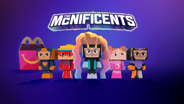
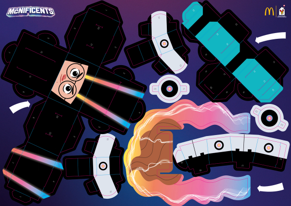
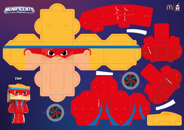
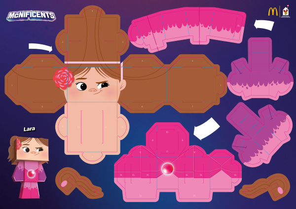
This was a passion project for us — it’s not every day where we have the opportunity to have an impact on someone’s life. Being part of this project is something Liz will never forget, and that’s the biggest reward we could ask for.
BUCK
Senior Producer
Carolina Brandão
Senior Art Director
Simon Buijs
Art Director
Christo Silveira
Character Design
Chelsea Lee
Christo Silveira
Grace Park
Mijke Coebergh
Rémi Borowczyk
Simon Buijs
Tuo Kan
Yana Abramova
Styleframes
Christo Silveira
Rémi Borowczyk
Storyboard
Tristyn Pease
2D Animation Lead
Daniel Rodrigues
2D Animation
Andrés Cuevas
Anna Moessnang
Daniel Rodrigues
Erik Righetti
Joe Brooks
Laurentiu Lunic
Léa Zhang
Cel Animation Lead
Tucker Klein
Cel Animation
Andrea Castillo
Daiqi Cui
Deco Daviola
Matty Deans
Stephen Loveluck
Tucker Klein
Editor
Talia Mazzarella
Live Action
Line Producer
Northwest Productions
Director of Photography
Floris van der Lee
Sound
Music Studio
Antfood
Sound Design Studio
Antfood
Audio Mix
Antfood
Color
Color Studio
Captcha
