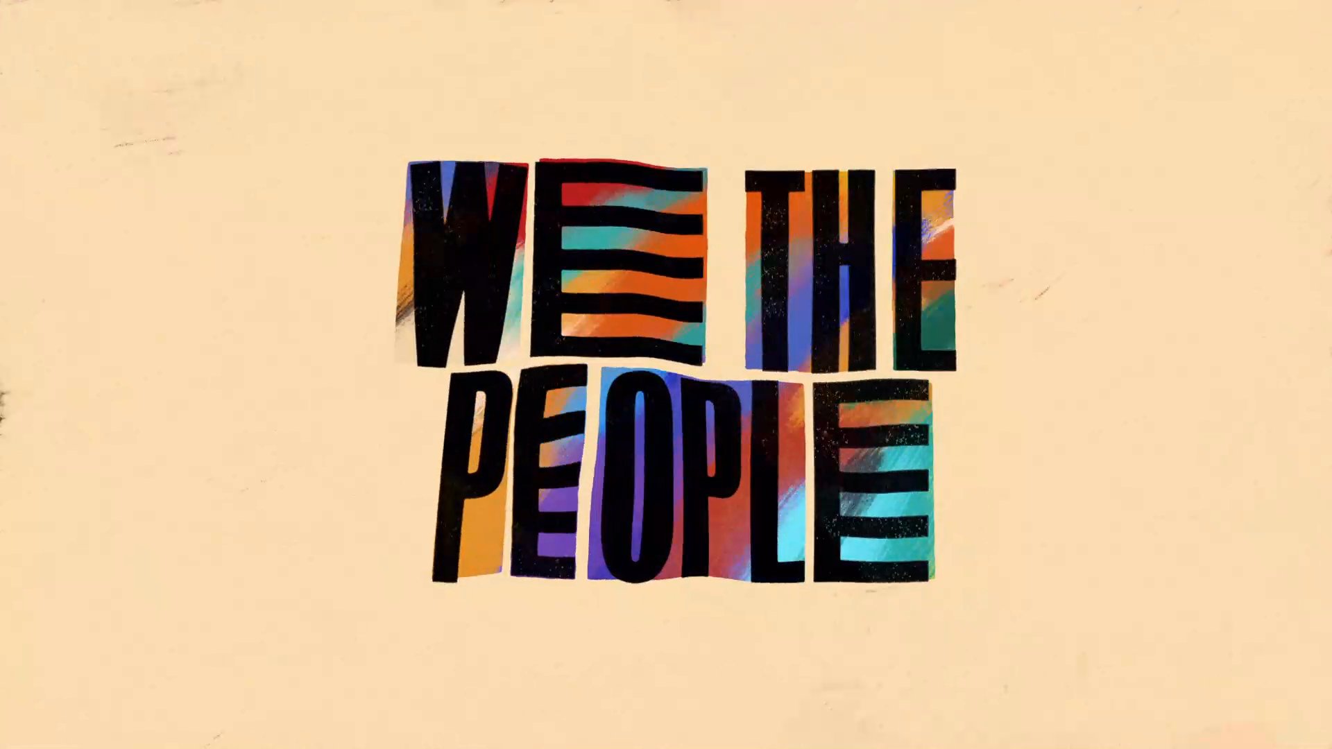
We The People "Active Citizenship"
2021
Made in collaboration with the Obamas, Peter Ramsey, H.E.R and Netflix, “Active Citizenship” is the first episode in a Schoolhouse Rock-inspired musical anthology series from Chris Nee and Kenya Barris entitled We The People that aims to give a civics crash course to a nation that thinks the filibuster is a topping at Cinnabon. At the first annual Children’s and Family Emmy award show in 2022, the series took home a statue for Outstanding Short Form Program.
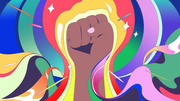
This story highlights the importance of active citizenship in order to create positive change in our communities. Powered by a groovy H.E.R soundtrack, the visual
style is an abstract representation of collective power, shared values, and inalienable rights.

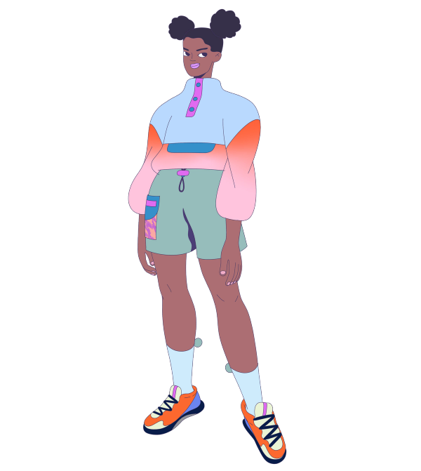
Meet Maya
The story follows Maya as she strives to bring positive changes to her community.
1. Color and Music Score ↓

Journey through Color Progression
More than just an aesthetic choice, color played a critical role in driving the narrative.
When we first meet Maya, she’s surrounded by a muted palette, but as she gains confidence and gets more involved in her community, the world around her becomes more vibrant, building to a hyper-saturated explosion of color (and vibes!).


2. Vibes ↓
Speaking of vibes, we needed a way to show Maya’s positive effect on her community in a tangible way. We chose to visualize this change through a fun, wavy shape—an abstract manifestation of Maya’s energy, enthusiasm and action.


Character Design
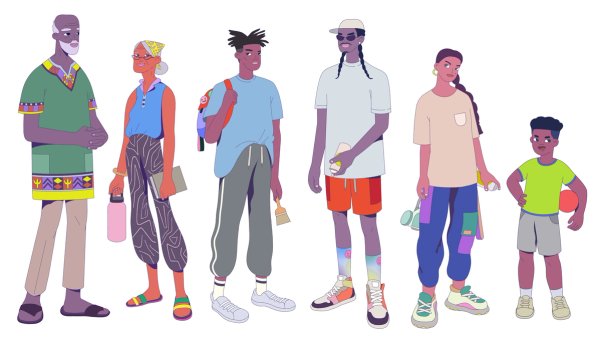
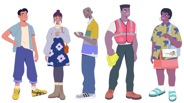
Unlike Schoolhouse Rock, the characters in We The People are meant to feel like real people who live in our world. We surrounded Maya with an authentic, raw, and diverse cast of characters.
3. Maya’s Journey ↓
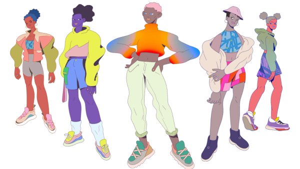
As the story progresses, we wanted to reflect Maya’s transformation. We did this not just through color but through her wardrobe as well — her style becomes bolder and more expressive over time.




4. Expressive Typography ↓
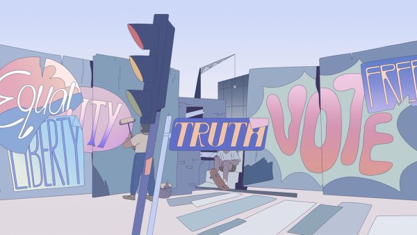
Typography played an important role. We wanted to find moments where we could bring the type into the world as a bold, defining feature — integral to the design, without feeling like an afterthought.

Shape Shifting Type
We balanced these scenes with softer compositions where the type is organically integrated — appearing as a pattern, a street sign, and in graffiti. We also used type as an abstract, transitional element.


5. BTS ↓
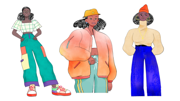
From finding the right visual language, to crafting bespoke characters, and building the larger world, we had a ton of fun exploring the concept during the initial design phase.



BUCK
Chief Creative Officer
Ryan Honey
Group Creative Director
Joe Mullen
Global Executive Producer
Emily Rickard
Executive Producer
Nick Carmen
Creative Director
Steve Day
Associate Creative Director
Janice Ahn
Senior Producer
Justin Harris
Art Director
Sol Lee
Associate Producer
Erin Lockard
Global Head of Design
Brian Won
Storyboards
Jake Armstrong
Junyi Xiao
Design
Bruna Imai
Colin Bigelow
Dan Muangprasert
Daniel Amdemichael
Debora Cruchon
Fabrizio Lenci
Janice Ahn
Jigyu Yoon
Jonas Mosesson
Julia Mattos
Lina Yu
Sol Lee
Sung Hyun Kim
Tony Legato
Tuo Kan
Global Head of 2D Animation
Daniel Coutinho
Animation Directors
Jake Armstrong
Joe Brooks
Previs
Anna Cardillo White
Ivan Sokol
Jake Armstrong
Junyi Xiao
Reza Iman
2D Animation
Ben Hill
Dries Van Broeck
Gonzalo Menevichian
Joe Brooks
Lisa Kim
Taylor Griggs
Cel Animation
Alexander Bernas
Ivan Dixon
Jake Armstrong
Junyi Xiao
Lumi Chang
Matthias Cuciniello
Olivia Blanc
Ryoko Kondo
Stephen Loveluck
SFX
TJ Rozsa
Colorist
Rick Wilson
Titles
Chief Creative Officer
Ryan Honey
Group Creative Director
Joe Mullen
Global Executive Producer
Emily Rickard
Executive Producer
Nick Carmen
Creative Director
Andy Lyon
Senior Producer
Justin Harris
Art Director
Debora Cruchon
Global Head of Design
Brian Won
Design
Colin Graham
Debora Cruchon
Mark Kulakoff
Global Head of 2D Animation
Daniel Coutinho
2D Lead
Nick Petley
2D Animation
Daniel Rodrigues
Delainey Cummins
Lumi Chang
Morgan Allison
Nick Petley
Cel Animation
Junyi Xiao
Matthias Cuciniello
